Episode #779
January 6, 2024
The trade show designers at GFB were trained at the prestigious Pasadena Art Center.
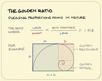
At the Art Center designers are taught the importance of style and proportion. The Golden Ratio is woven into all their designs.
The Golden Ratio, often denoted by the Greek letter phi (φ), is a mathematical constant approximately equal to 1.618. It is a unique and aesthetically pleasing ratio found in various aspects of art, architecture, and nature.
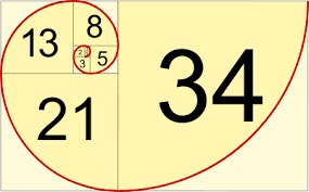
The ratio itself comes from the Fibonacci sequence, a naturally occurring sequence of numbers that can be found everywhere, from the number of leaves on a tree to the shape of a seashell. The Fibonacci sequence is the sum of the two numbers before it. It goes: 0, 1, 1, 2, 3, 5, 8, 13, 21, 34 and so on, to infinity. This proportion is often considered visually appealing, leading to its frequent use in design and composition.
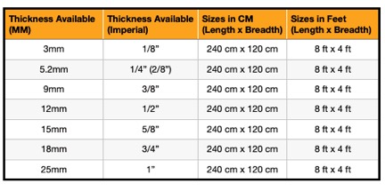
In the exhibit house a standard wall component was 4’ wide by 8’ tall. This is largely because plywood in the United States is manufactured in 4’x8’ sheets. This size walls used the materials the most efficiently and therefore was the most cost effective. One of our designers insisted on walls and cabinets with 3’ and 5’ dimensions because they were Fibonacci numbers. While those proportions were pleasing they added 20% more in cost through waste and additional labor. A run of walls is utilitarian with no need to follow the Golden Ratio. The company’s profit outweighed the appeal of design proportion, so we stuck with 4×8 walls.
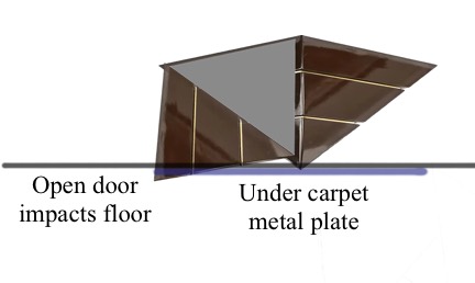
One day, when designing a cabinet, a designer drew it to be an upside down pyramid. Very cool looking. My job was to make sure we could build what the designer drew, so I asked:
“How will it stand?”
“Not sure,” he replied.
“We can put a metal plate under the carpet as a foot. We will have to cut a slice in the client’s carpet, however.”
“That will work.”
“I see you have a hinged door on this side of the cabinet. Do you see what will happen when the door is opened?”
“What do you mean?”
“The door will impact the ground as it swings open.”
“Oh,” said the designer. “I guess we will have to velcro the door in place.”
While the design elements of the cabinet were interesting and visually appealing they failed to consider the practical element of assembly on the show floor. They also did not consider that human beings would have to open the door in the real world.
I recently bought a new clothes washer. It was advertised to have a lower decibel level than previous models. This was true. The machine is quieter than the washer it replaced. However, the frequency of the sound it makes is much higher than previous models. The sound is a loud version of the buzzing and whirring of an inkjet printer’s motorized head movement and nozzle firing. While the sound is technically quieter, the high frequency can be annoying. This is a case of the washing machine engineers checking one box while neglecting to consider the user’s ears.
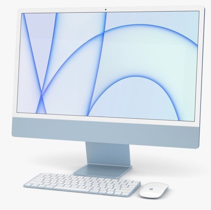
Jony Ive was a great industrial minimalist designer. I have always thought that simpler is better. Simple is easy to understand and often easier to operate. The original iMac was a beautiful all-in-one teardrop shaped computer. It was esthetic and functional at the same time.
As the iMac evolved it became simpler until it was little more than a slab of glass and metal, yet it retained its functionality and fit into any office environment.
The same evolution occurred with the MacOS operating system. It began as a graphically pleasing metaphor for an office. Ive shifted the color scheme to a flatter, more pastel environment. In the process he simplified the viewing windows to be less and less cluttered. Users enjoyed these changes because they made it easier to find what they needed and use it. For the sake of a clean, mostly empty window Ive began hiding controls as invisible buttons. While all the controls were still available from the program menus, many often used in-window controls were secreted away in the right click contextual menus. Others were visible only when you hovered over them. No instructions were included as to where the invisible buttons were. The user just had to figure them out. Most users never did.
Style, proportion and minimalism are all worthy design goals. In the end, however, human beings use the things that designers design. Engineers and designers would be best served to create products that they would enjoy using themselves.
Coupled with the Golden Ratio should always be the Golden Rule:
“Do unto others as you would have them do unto you.”
— Jesus, Luke 6:31 and Matthew 7:12
IF YOU LIKED THIS BLOG YOU WILL LOVE MY BOOKS:
“Skydivers Know Why Birds Sing” by Ricki T Thues is now available on Amazon.
It is a Love story of Rick and Paula Thues and their 35 years of Skydiving.
Click HERE to buy the paperback or Kindle ebook at Amazon.
Follow Ricki T Thues on Amazon HERE.
ALSO AVAILABLE:
“Technically Human” by Ricki T Thues, the iMentor, is available on Amazon.
It is a compilation of selected episodes from this bLog which tell the story of Humanity through the eyes of the iMentor.
Click HERE to buy the paperback or Kindle ebook at Amazon.
The ebook version of “Technically Human” is also available on Kobo. Click HERE.
For you Barnes and Noble Nook readers it is available for Nook. Click HERE.
The “Technically Human” ebook is also available on Apple Books . Click HERE.







Well said and very true. Good design makes things clear to the most people
Designing POP displays for 23 years had me dealing with the concept of practicality vs. complexity vs. price all the time. And, no matter how cool the design would look the customer always ended up buying the cheapest design version anyway….
Glad I am retired from that field…